As you may have seen - I have blogged like there is no tomorrow today. I am so close to being up-to-date and ACTUALLY BLOGGING ON THE DAY I'M WRITING ABOUT!! How exciting!
I've also spent a little bit of time trying to jazz up my blog page too - so cunningly I've finally worked out how to get a slide show on here, and once I'd worked that out - I've decided to have 2.
Also, something that was really annoying me was that the right-hand side of my blog, when you start scrolling down the blogs is just empty and black - I didn't like it!
So, where I was originally going to put everyone's biographies as separate blogs, I also worked out a way to get them running down the right-hand side on every page.
It just balances up the page nicely - and highlights the people involved permanently on the page - which I think is important.
I'm really pleased with what it looks like now, especially as the biographies span the entire length of the page to match the lengths of the blogs (virtually) so it's nice and neat and logical to the eye.
I have been thinking about trying to make my blog as pleasing to the eye as possible - as I'm conscious that people may get bored with a big bulk of text, especially as there aren't too many things which I can link to (i.e. external links to other websites) because the project IS the project and sits within itself. We don't have any external links, we are self-supporting, and this type of project is at the vanguard of it's kind - so I can't even link to similar items.
Personally, I think that having lots of things to click on, or look at or whatever to make a page interactive is really important to sustain someone's interest - so as I can't link to too much, having the biographies running down the page is a more than adequate substitute.
The only thing that is a little annoying, which I can't do anything about is now with the slide show at the top - you don't see any of the text/blogs until you scroll down a little. If I make the slide show any smaller however - it'll kind of lose the point I think.
So, I'm sticking with what I've done as I think it looks good.
Another thing that I've spent quite long on today is the order of that right-hand column and playing around by trial and error with exactly what should come where. I've settled on having the blog archive at the top, purely because you can't see the blogs straight-off when the page loads up.
Then I figure a picture of me, and a quick 'welcome to my blog' and explanation of what the blog is about naturally wanted to come next (particularly with my stupid cheesy smile - it's so 'Have a Nice Day!!') Then my little biography, then a tease for people to continue scrolling for the rest of the biographies, and finally the biographies in alphabetical order.
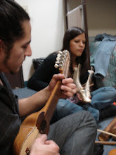
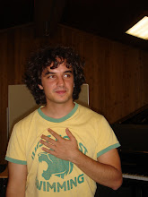
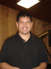
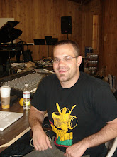
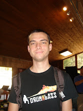
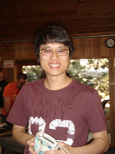
For the members of the team who have websites - I've linked those websites from their profile pictures within the biography list - so some of the photos are interactive at least.
Finally, I'm also particularly pleased with the layout because people generally want to know about people (because, regardless of how much we may protest this - we all are a little bit nosey!) so by having the biographies there - it teases people to scroll down, I've then made my titles as grabbing as I possibly can (and sometimes that was really hard when the stuff I'm talking about is mainly me saying I don't have any time!!) Also I've made sure there are moving avatars and pictures in most of the blogs - which hopefully then should lead people's eyes across to the left to read the blogs.
I hope!
Aaah, the psychology of the publicist and advertiser (and supermarkets!)





.jpg)




No comments:
Post a Comment